You are not logged in.
- Topics: Active | Unanswered | Last 2 weeks
#1 2014-05-21 01:36
- Andrew
- Senior Member
- Registered: 2008-05-22
- Posts: 542
Why are there different menu styles in different places?
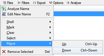
File menu has style #1 (dark blue highlight, bit more compact) but Shell sub-menu has style #2 (light blue highlight, items bit more spaced out):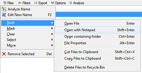
Mark sub-menu has style #1 again: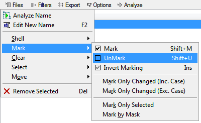
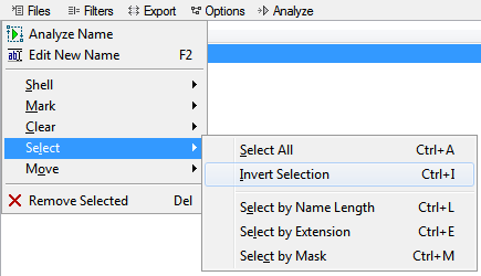
Clear, Select and Move sub-menus all have style #2: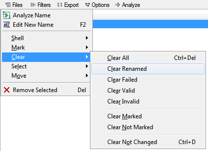
Export menu also has style #2: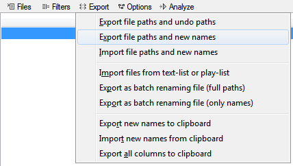
But Options menu has style #1 again: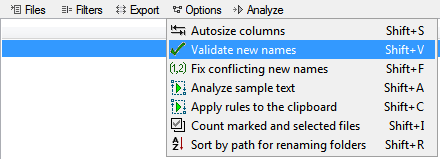
What gives and why the weird inconsistency? IMO style #2 ought to be used everywhere since it is the default one used by Windows and most apps.
Last edited by Andrew (2014-05-21 01:39)
Offline
#2 2014-05-21 17:20
- den4b
- Administrator

- From: den4b.com
- Registered: 2006-04-06
- Posts: 3,544
Re: Why are there different menu styles in different places?
This is a limitation of the component library. You might have noticed, all menus which have style #1 (dark blue highlight, bit more compact) have at least one icon in the menu. The current component library uses custom drawing of the menu when it needs to draw an icon, while menus without icons are drawn by the operating system.
The only true fix for this is to upgrade/migrate to a newer component library (newer development environment). Not ready to do that yet.
Offline
#3 2014-05-27 02:09
- Andrew
- Senior Member
- Registered: 2008-05-22
- Posts: 542
Re: Why are there different menu styles in different places?
But can't menu style #2 (which you say is drawn by the OS) contain icons too? See the examples from Windows Explorer below:
![]()
![]()
So why not just use style #2 for all the menus so it looks consistent, or is that not possible without updating the component library?
Offline
#4 2014-06-04 15:30
- den4b
- Administrator
- From: den4b.com
- Registered: 2006-04-06
- Posts: 3,544
Re: Why are there different menu styles in different places?
...or is that not possible without updating the component library?
Exactly right! ![]()
Offline
#5 2014-08-13 23:40
- Andrew
- Senior Member
- Registered: 2008-05-22
- Posts: 542
Re: Why are there different menu styles in different places?
So did you update the component lib in 6.0.0.1 alpha, because this seems to have been fixed?
Offline
#6 2014-08-18 23:29
- den4b
- Administrator
- From: den4b.com
- Registered: 2006-04-06
- Posts: 3,544
Re: Why are there different menu styles in different places?
Yes, there is a newer components library now.
All menus have a consistent (native) look and feel.
Offline