You are not logged in.
- Topics: Active | Unanswered | Last 2 weeks
Pages: 1
#1 2010-11-24 22:21
- Andrew
- Senior Member
- Registered: 2008-05-22
- Posts: 542
Need to use better font throughout
Most anywhere in the app where text is to be entered (say in any rule), the font chosen is unfortunately such that 'l' (small letter L) and 'I' (capital letter I) look exactly the same, and '|' (pipe character) looks quite similar to these two. Capital 'L' or small 'i' or digit '1' look different, so those are not an issue.
Can't we have a better, more visually distinct font selected for use throughout the UI?
Offline
#2 2010-11-25 08:03
- SafetyCar
- Senior Member
- Registered: 2008-04-28
- Posts: 446
- Website
Re: Need to use better font throughout
The "Tahoma" is a common substitution to arial. It takes almost the same space, I think it's a good option.
If this software has helped you, consider getting your pro version. :)
Offline
#3 2010-12-16 13:40
- den4b
- Administrator

- From: den4b.com
- Registered: 2006-04-06
- Posts: 3,479
Re: Need to use better font throughout
Ok, "Tohoma" seems like a good alternative. I'm adding this to the development list.
Offline
#4 2010-12-16 22:22
- Andrew
- Senior Member
- Registered: 2008-05-22
- Posts: 542
Re: Need to use better font throughout
Thanks Denis! ![]()
Offline
#5 2014-05-20 06:25
- Andrew
- Senior Member
- Registered: 2008-05-22
- Posts: 542
Re: Need to use better font throughout
Ok, another highly belated follow-up:
The PascalScript dialog looks fine but the file list still doesn't:
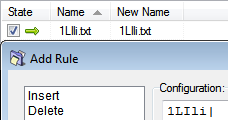
Same problem still with the various text boxes:
No confusion in Windows Explorer: 
Denis, is this something that can't be fixed easily?
Last edited by Andrew (2014-05-20 06:32)
Offline
#6 2014-05-21 16:26
- den4b
- Administrator
- From: den4b.com
- Registered: 2006-04-06
- Posts: 3,479
Re: Need to use better font throughout
It's done.
In v5.75.3 Beta the default font is "MS Shell Dlg 2" which normally maps to "Tahoma".
Also, I've increased font size of most text fields from 8 to 10 points.
Offline
#7 2014-05-27 01:08
- Andrew
- Senior Member
- Registered: 2008-05-22
- Posts: 542
Re: Need to use better font throughout
The switch to Tahoma seems to have helped everywhere I checked, so thanks Denis!
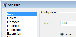
P.S. Here's one you seem to have missed:
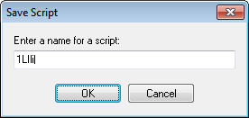
Any more that got left out I wonder? Might as well get 'em all while you're at it. ![]()
Last edited by Andrew (2014-05-27 01:30)
Offline
#8 2014-06-04 13:30
- den4b
- Administrator
- From: den4b.com
- Registered: 2006-04-06
- Posts: 3,479
Re: Need to use better font throughout
Font in message dialogs and input dialogs is harder to adjust. These are stock dialogs and to make any changes would require significant recoding.
We will have to leave it at that for now. It may be worthwhile revising later, but I have a feeling that ReNamer will be soon migrated to a newer development environment and these font related issues will go away.
Offline
#9 2014-06-12 17:40
- Andrew
- Senior Member
- Registered: 2008-05-22
- Posts: 542
Re: Need to use better font throughout
I have a feeling that ReNamer will be soon migrated to a newer development environment and these font related issues will go away.
Interesting... Planning to ditch Delphi? For what? I guess this is related to the planned cross-platform development of the app, right?
Last edited by Andrew (2014-06-12 17:42)
Offline
#10 2014-06-14 10:09
- den4b
- Administrator
- From: den4b.com
- Registered: 2006-04-06
- Posts: 3,479
Re: Need to use better font throughout
Interesting... Planning to ditch Delphi? For what? I guess this is related to the planned cross-platform development of the app, right?
You guessed it right! I have explained it a little more in another post.
Offline
Pages: 1